Looking good! 👍
Very cool 👍🏽 Make that 4…
👋👍
Hi all,
No problem - happy to share the project file for this.
Firstly though, beyond answering the odd question about it here, I offer no support with this. Nor do I claim that the approach I took is necessarily the best / most efficient approach.
Anyway, here you go.
Enjoy!!
p.s. this project uses @Jannis’s Void theme and has a background colour of #0b0c10 set in that.
Thank you, Stuart- most kind of you to share the project file. I learn best by deconstructing- so I’m looking forward to downloading tomorrow morning and playing with it. Cheers!
Very nice.
Thanks v much Stuart!
Wanted to see how much of this I could actually do with Foundry and was quite surprised with the results. Obviously way less control / fine-tuning options than with the BWD stacks but I put this together in under 2 hours and I think it looks good.
This is mainly just Foundry core product though it does use Overlap stack from Potion Pack and also Reveal Pro stack from the new Thunder pack (unfortunately the Reveal Pro animations don’t work on mobile/tablet and so that is a big miss I think). No non-Foundry stacks were used.
Well done. I too am surprised that you got so far with Foundry but the end result looks good. Shame about the reveal pro animations on touch devices. As you say there isn’t the fine tuning that the BWD stacks provide.
Who’s going to do a Foundation version?
There are a couple of things where I had to do things in a way I didn’t really want to but overall I was impressed.
That would be good to see!
@Nostrildomus just an FYI- Stuart shared it a few posts above yours. It’s been downloaded about 30 times, so far. :-)
@dave The project file that habitualshaker kindly made available, was for the first BWD version running on the inStacks blank super quick theme.
The second demo was built using Foundry with Potion Pack and Thunder Pack and no BWD or other stacks.
@habitualshaker Would you be willing to share your Foundry project file? You did a fantastic job with the website and I’d learn a lot from how you put it together. If you don’t want to share (doesn’t matter the reason) that’s fine too.
It’s interesting flicking between the 2 sites, one is a webpage and the other is an Apple webpage, one scrolls, the other flows. The difference in feel is remarkable.
Well done on both @habitualshaker
yes - i can make it available. I’ve spotted a couple of minor issues (in both projects) that i’ll fix up first.
@habitualshaker That’s very kind. Many thanks!
Yes please!
I see you have used the new Thunder Animated Animated Dividers, and while it’s a nice effect, Apple don’t use animated dividers in their page. This is a good example of Apple’s less is more approach to page design. Not a criticism of what you’ve done but just an demonstration of too much animation can take the design over the top.
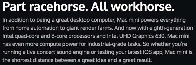
Also, the Foundry version (below) has noticeably heavier text and I see can’t any reason for it in the code.

Compared to the BWD version below
I didn’t use the new animated dividers. They only allow you to set a fixed width so weren’t any use. I just used the regular divider stack inside a reveal pro. And I just copied the Blocs page as opposed to the apple one directly.
I’ll have a look at text size / spacing. I didn’t really take too much time to make it exactly like for like.
Didn’t realise the Animated Dividers were fixed with! Just assumed you threw them in as a quick solution. On the topic of fixed width, parts of the Apple MacMini page are non responsive. Check out the tab section on a mobile and the 2 right most tabs are off screen. Shame on Apple. Even their web testing is getting sloppy.
