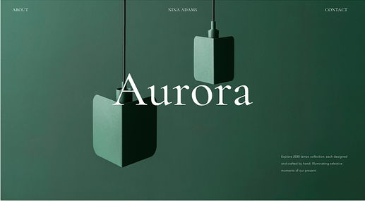
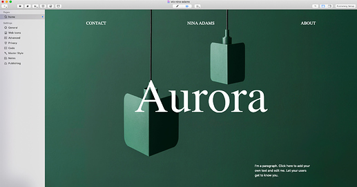
Ever the sucker for a well-done Swiss grid, the new Wix looks very attractive.
1 Like
Just for fun I recreated the first section in UIkit. The image is what makes the impact, for the design is minimal:
2 Likes
Yeah, but…WYSIWYG. This is pretty brilliant.
Wix sites can be hilarious with ad blockers. I remember once visiting a site that was reduced to a blank white page. Using Brave I don’t see those cubes, just a big empty black space.
I guess a big blank white page would be the ultimate in minimal design :)
Apparently, though, it is only the free websites that feature ads. For a nominal, not outrageous monthly fee, there are no ads.
A white page might even score well with Google mobile usability.
3 Likes

