will grab the plus stack (even more stuff to play arround with :)
Well that’s a very valid point. And not one I’d really considered. I do think though, that so long as the logic behind all the different menus is the same, and they look and feel the same, it shouldn’t be an issue. But regardless, you raise a very good point.
I should mention, the instance of six menus, I’m bending the truth slightly to prove a point ;-)
My main business site is actually two different sites, styled to look the same and essential joined at the hip. The user shouldn’t realise when the move from one site to the other, and back. So technically it’s six menus over two sites. But I never let technical reality get in the way of proving my points ;-)
2 Likes
like that!
That would work. You could even write that as 200px repeat(5, 1fr) to make it a bit cleaner. To keep those 5 columns centered you could even add another 200px column at the right side 200px repeat(5, 1fr) 200px.
In any case, the next update for Grid Plus will actually make this all a bit easier and not require the use of individual columns at all (as it will allow you to display any inline items - like BP2 buttons - in a row as opposed stacked in a column).
2 Likes
Interesting to see what the next update will bring, it’s slowly starting to sink in how to get the stacks to do what I want.
On Grid Plus there is a difference between the main stack and the child stack that I wondered if it was something I’m missing or one of those minor things.
In the main Grid Plus stack starts with the grid definitions, then goes for Breakpoint 1 which is effectively smaller to medium with a default of 600 px, then Breakpoint 2 which is more medium to large with a default breakpoint of 900 px.
However in the Grid Plus Item stack it’s the opposite way round, Breakpoint 1 has a default of 1200 px, followed by Breakpoint 2 with a default of 900 px, then a final bit of when to set to a span of 1 (kinda mobile breakpoint?).
So am I reading things correctly to see that Grid Plus goes small to large but Grid Plus Item goes large to small?
Cheers,
Paul
Yes - you are right @pmjd - the order that the breakpoint options are presented does differ in the parent grid and the child grid. This is by design - will try and explain my logic…
The parent grid obviously allows you to set up the basic structure of the whole grid - and the stack gets you to do this in a ‘mobile first’ way - starting on a small screen and working up the way. This is the normal way of doing things.
The child grid breakpoints are only required at all if you want to set up any items to span multiple columns (or overlap / stack items). When I was putting the stack together I found that when setting spans it was much easier to start with how you want the full grid to look (I.e how it is displayed on desktop) and work down to how things look on mobile - which is generally by resetting any spans to 1 so that items stack.
Hope that makes sense / appears at least somewhat logical?
1 Like
Hello
As a French speaking guy, able to speak and write in international English, may someone explain me what the concept “span” is :
MaybeI should not ask this question here (so my excuses for the inconvenience) but as it is written here, I wanted to ask your help.
Thanking you in advance.
Dominique.
BTW I bought Source,add ons, and the 2 courses: I find this really easy to use and understand the concept. I like Source’s simplicity, easy of use to make nice looking sites. I am a non designer, non coder.
BTW2: @habitualshaker It is not always easy to understand your English with you accent :-) (joking) for non English speaking people
1 Like
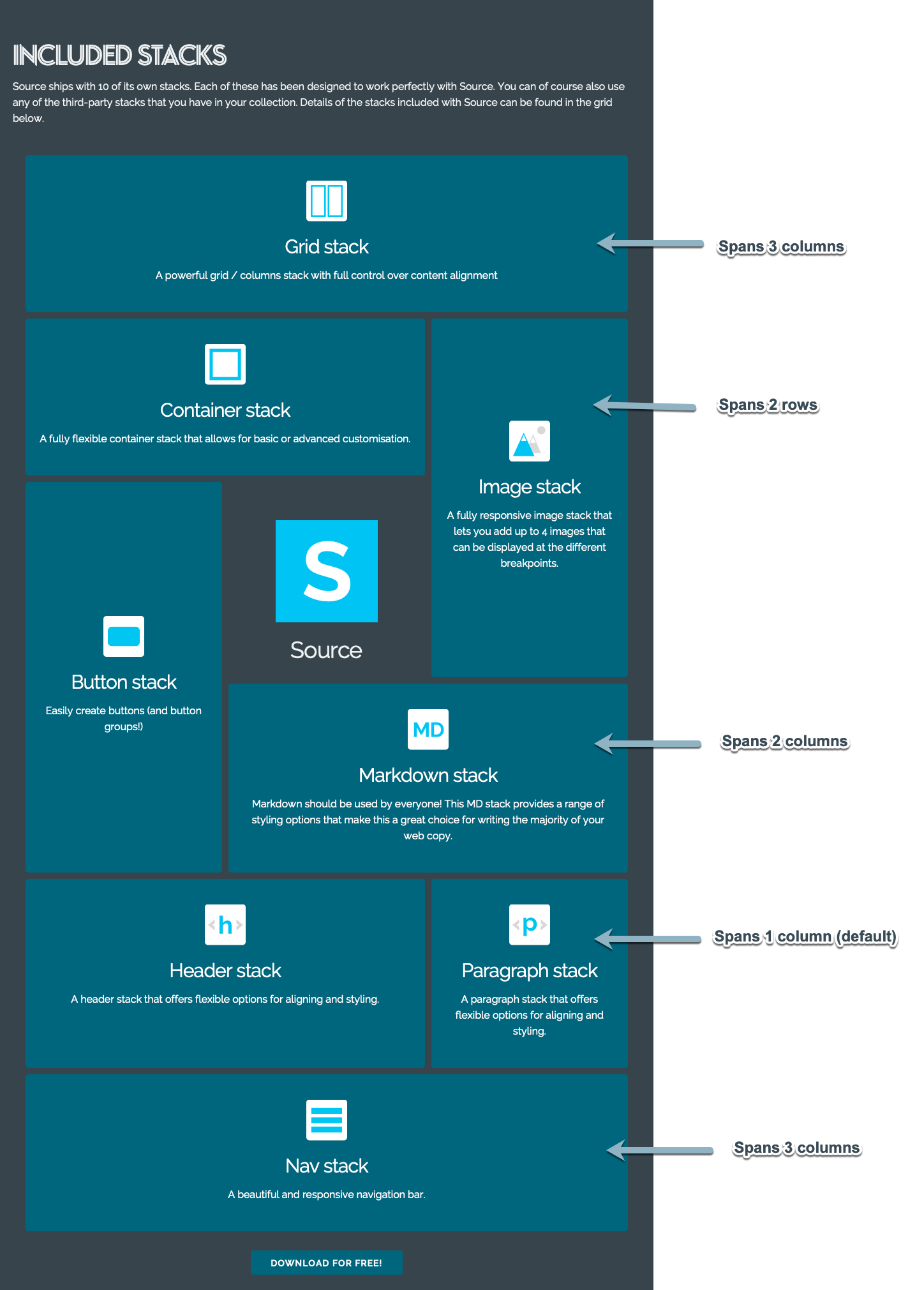
A span is when you want a grid item to extend across multiple columns or rows (as shown below).
I actually have quite a tame Glaswegian accent. Will see if I can adopt a more neutral accent in future videos :)
3 Likes
Please, don´t do that! I like the accent and find myself trying to mimic it while watching your videos. :D always great fun - but pretty difficult by the way.
4 Likes
Thank you.
Very clear now.
1 Like
Interesting to hear the logic behind it, I will start to use Source more soon so will see if I work the same way myself.
I wouldn’t worry about your accent, it perfectly clear, you could always try a video with a broad Weegie accent for comparison lol
1 Like
Consider it done. Will knock back a couple of cans of Tennents Super Lager just prior to hitting record - that should unleash the accent nicely!
1 Like
That’s a really good infographic that explains the concept of a span in Source.
You should create another one to show the Source alignment options available in Containers and Grid Items.
When you understand this stuff, the old world concept, that is columns that must adhere to a 12 column in 1 row fixed format, you realise how advanced Source is and how it is so far ahead of anything else in RapidWeaver. It becomes difficult to go back and use those antiquated frameworks.
3 Likes
I totally agree with @Papart about the accent.
Please keep it as it is, it’s part of what makes the courses so unique!
3 Likes
This would be very helpful. Vote +1 from me!
1 Like
A rough and ready example of a custom nav built using Grid Plus: Custom Nav | STH Demos
I should hopefully get the update that will allow this pushed out tomorrow! It uses a new option to display the contents of a grid item in a horizontal row. This will only work with inline stacks (such as the Button Plus buttons used here).
1 Like
@Papart With respect I would discourage people from using ButtonPlus2 and Popdrop to make menus. Menus do not close when another is opened and they are a car crash on touch devices.
I get hundreds of support emails when people try to do this and I would therefore suggest that people do not do it.
MenuLab will do all this sort of thing but in the meantime, if the Foundry Mega Menu is crucial to your site design then I suggest that you continue to use it in the meantime or in the absence of another solution. Don’t buy a 2 seater sports car if you need to transport 4 people.
3 Likes
@tav Will consider Your advice for sure! I am not in the phase of detailed testing (mobile behavior etc). I just started to explore source - and the navigation became the first challenge.
The story behind my initial question - which stacks could substitute certain foundry stacks - was the fact that after playing Arround with foundry, then platform, then UiKit in order to relaunch a foundry-website I never felt comfortable with the results and/or usability of these frameworks.
Since playing Arround with source it finally felt like „this is it“ although certain foundry stacks were suddenly missing in my workflow. Especially mega menu since the navigation is indeed crucial for what I want to build.
My problem is that I would have to choose foundry (again) over source in order to use the mega menu stack - but source feels just good to make that decision. :)
Foundry is without doubt a great franewirk, simple to use and was my no…1 choice for 2 years. but it lacks many features in order to get the details just Right. And as soon as you start to thriw in more and more third party stacks to fix the details the full featured framework doesn‘t make sense anymore
any chance that menu lab will be released Before 2020?
Yes, for me, the navigation is one of the single most important design and UX elements.
This was exactly what @habitualshaker made Source so I am sure he will be pleased that you saw this point straight away.
Honestly, probably not that quickly as I am about to release the new replacement for Sections Pro but it will be coming immediately after that, it is 90% finished at present.
1 Like
Am I right in thinking that you don’t have any reservations about Limelight being used to create a mobile-only menu, Andrew?
Thanks
Rob