Curious if there’s a stack (or relatively simple way) to create an animated underline of a header that looks like a marker stroke, sort of similar to this:
You have F6. Use the underscore swatch….
https://www.foundationstacks.com/demo/swatch-pack/#underscore
Thanks. Is it possible to get the effect that it looks like a sharpie or highlighter with that swatch? It looks like the site I reference uses an SVG. Should I be trying an SVG / animate swatch combo?
The logo I’ll be using is styled to look like it was drawn with a sharpie and they saw this style of animated underline and liked it.
you can also create a single SVG with text and logo.
With QuickSVG Stack you can animate your SVGs
3 Likes
Prova così
CSS:
.underline-animation {
  text-decoration: none;
  position: relative;
  white-space: nowrap;

  svg {
    position: absolute;
    top: 0%;
    left: 0;
    width: 99%;
    height: auto;
  }

  .stroke {
    stroke: green;
    stroke-width: .3em;
    stroke-dasharray: 822;
    stroke-dashoffset: 822;
    animation: underlineAnimation .7s 1s linear forwards;
  }
}

@keyframes underlineAnimation {
  from {
    stroke-dashoffset: 822;
  }
  to {
    stroke-dashoffset: 0;
  }
}
HTML:
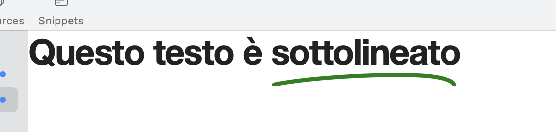
Questo testo è
  <u class="underline-animation">
  <svg xmlns="http://www.w3.org/2000/svg" viewBox="0 0 500 150" preserveAspectRatio="none"><path d="M7.7,145.6C109,125,299.9,116.2,401,121.3c42.1,2.2,87.6,11.8,87.3,25.7" class="stroke" fill="none" stroke-linecap="round" stroke-linejoin="round" stroke-width="10" /></svg>
  sottolineato</u>
7 Likes
Wow, thanks for that!
While slightly different, I thought I would build a nice demo of an animated highlight. Actually thinking about it now, you could take what I did and make it super similar to what you want without an SVG. Just need to make the pseudo element a few pixels high and then add an advanced border radius.
3 Likes
Thanks Joe! I’ll give this a closer look when I have some time over the break
1 Like
In case you need it, since I have half an hour free now, I’m sending you a variation:
- I created the svg with Amadine
- now the animation has a delay of 1 second, it stays for 7 seconds, disappears for 2 seconds, then repeats infinitely (similar to the example site)
- to insert the html I used Scribe by BWD inserting in CSS Classes H1, H2, H3
- with the .stroke you can now modify the animation
- with top: of the svg you can modify the distance from the text.
Scribe:
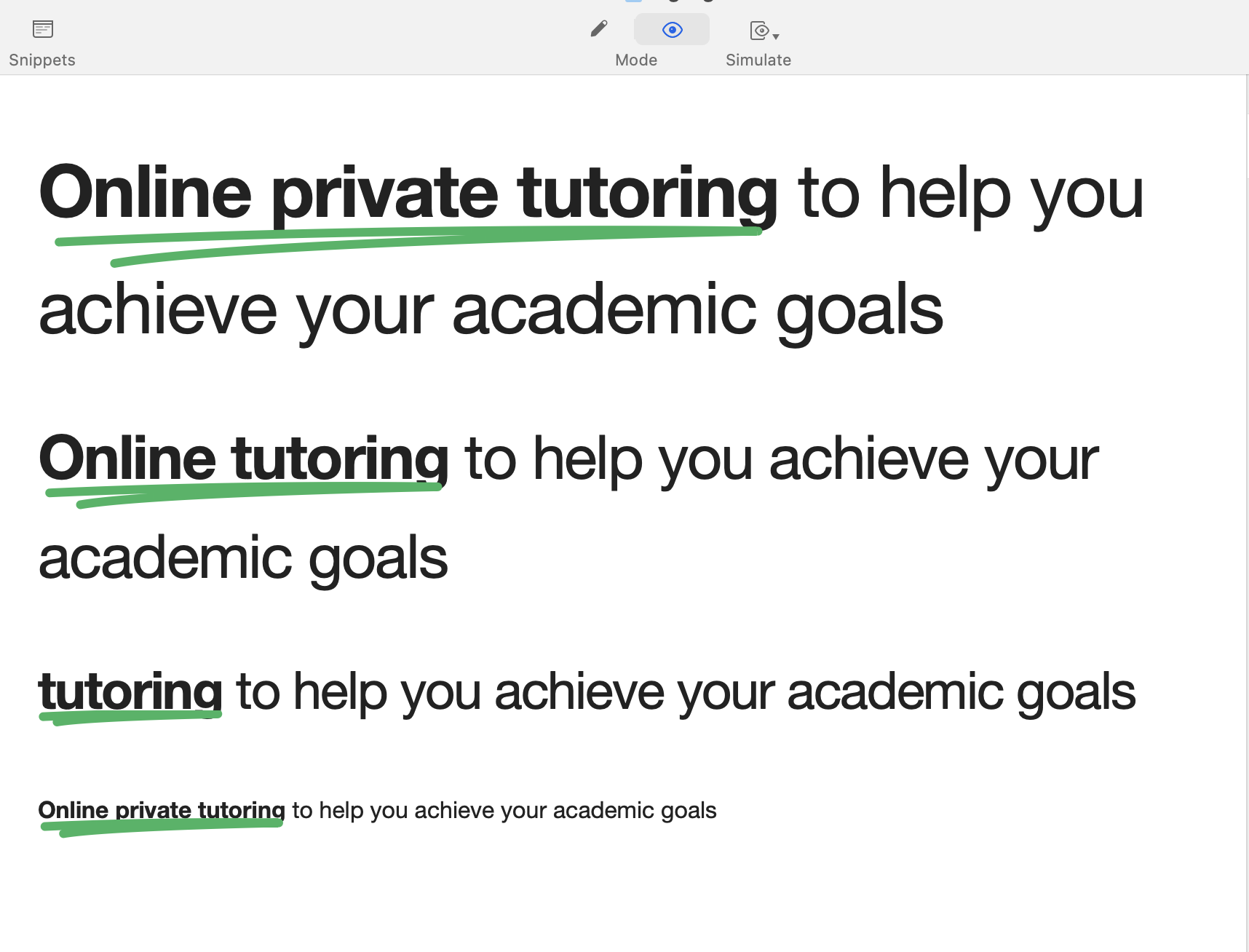
<u class="underline-animation"><svg xmlns="http://www.w3.org/2000/svg" viewBox="0 0 255 32.61"><path d="M7.29147,8.66539 C7.29147,8.66539,60.2814,5.99571,129.953,5.01441 C199.625,4.03312,247.709,4.90409,247.709,4.90409 C247.709,4.90409,71.5819,8.27282,26.3723,16" class="stroke" fill="none" stroke-linecap="round" stroke-linejoin="round" stroke-width="10" /></svg> **Online private tutoring**</u> to help you achieve your academic goals
CSS:
.underline-animation {
  text-decoration: none;
  position: relative;
  white-space: nowrap;
  line-height: 2em;

  svg {
    position: absolute;
    top:.96em;
    left: 0;
    width: 100%;
    height: auto;
  }

  .stroke {
  	stroke: #2EB560;
  	vector-effect:non-scaling-stroke;
stroke-width: 6 !important;
    stroke-dasharray: 1000;
    stroke-dashoffset: 1000;
  animation-name: underlineAnimation;
  animation-duration: 10s;
  animation-timing-function: ease-in;
  animation-delay: 1s;
  animation-direction: normal;
  animation-iteration-count: infinite;
  animation-fill-mode: forwards;
  animation-play-state: running;
  }
}

@keyframes underlineAnimation {
  0% { stroke-dashoffset: 1000; }
  4% { stroke-dashoffset: 0; }
  49% { stroke-dashoffset: 0; }
  80.9% { stroke-dashoffset: 0; }
  81% { stroke-dashoffset: 1000; }
  100% { stroke-dashoffset: 1000; }
}
I hope it helps you.
6 Likes