Prova così
CSS:
.underline-animation {
  text-decoration: none;
  position: relative;
  white-space: nowrap;

  svg {
    position: absolute;
    top: 0%;
    left: 0;
    width: 99%;
    height: auto;
  }

  .stroke {
    stroke: green;
    stroke-width: .3em;
    stroke-dasharray: 822;
    stroke-dashoffset: 822;
    animation: underlineAnimation .7s 1s linear forwards;
  }
}

@keyframes underlineAnimation {
  from {
    stroke-dashoffset: 822;
  }
  to {
    stroke-dashoffset: 0;
  }
}
HTML:
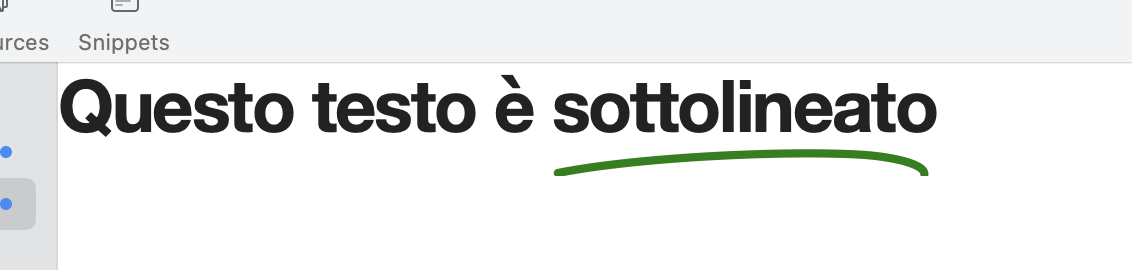
Questo testo è
  <u class="underline-animation">
  <svg xmlns="http://www.w3.org/2000/svg" viewBox="0 0 500 150" preserveAspectRatio="none"><path d="M7.7,145.6C109,125,299.9,116.2,401,121.3c42.1,2.2,87.6,11.8,87.3,25.7" class="stroke" fill="none" stroke-linecap="round" stroke-linejoin="round" stroke-width="10" /></svg>
  sottolineato</u>