I feel a bit stupid putting this up, but I find myself pondering how to best pad with Blueprint, Scribe Sidebar etc. in a way that is efficient. I mess about a lot with padding adjustments across the screen sizes and would love to simplify it. If anyone has a proceedure that covers most bases? I would love to know.
It’s an interesting question and one to which there is no right or wrong answer.
There are basically two ways to approach left and right padding, either use a percentage based system or a pixel based one. If using percentages then you may want to just use a % width along with a minimum width and a maximum width. This will remove the need for padding of the main container and maximises horizontal space on different screen sizes.
The other way is obviously to use a series of pixel based left and right paddings for various breakpoints, this is less fluid and doesn’t always make best use of the space.
Generally though, the main piece of advice would be not to over think it. Different situations call for different use of white space, do what looks best and use other sites with similar content as a guide.
Hi tav, your reply left me laughing as it is an unanswerable question in a way. But thanx for your input. I will explore your percentage based approach… it makes sense. Thanx
Not so much a rule of mine, but this works for me…
If the content is an image, or contains an image, and I want a nice even margin/border on all sides of the image that touches the edge of the container (BP) I use pixels.
If the content in text I use percentage.
I’ve gone this way as I find percentage the better approach, but I’m anal and a control freak about how images are contained, so revert to pixels in that instance.
Definitely though, percentage is far more fluid and tends (IMO) to end up with pages that are more balanced.
Okay, I’m taking it into specifics… so I understand.
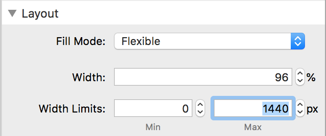
Using blueprint as a wrapper/container @say 96% flexible of a 1440px width site
How would you define mobile/medium/large / width limits?
Thanx steve, its good to have these in my noodle. I have also been a pixel person, but the modern day of % is apon me!!
Set Fill Mode in the Layout settings to Flexible then 96% width and enter 1440px as the max in the Width Limits

Then do similar for the Medium and Large device layouts.
By default, they are set to Inherit which will use the basic (mobile) settings above. By changing each of their Fill Modes to Flexible then you get control of their responsive settings (don’t forget that the breakpoints are set at the top)
I did that but added a minimum to each. But I see its not needed. Thanx