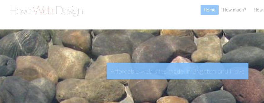
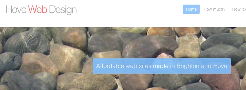
I’m seeing some strangeness when my site is viewed with Google Chrome. It only applies to the Site title and Site slogan. I’ve not looked at the site in a while - certainly last time I checked, it all looked OK and I’ve made no design changes in a long time.
In RW Preview and Safari and FireFox, all is fine. But when you view the page using Chrome the title and slogan text is barely readable. I’m attaching a couple of example images. The site is at https://www.hovewebdesign.com.
Any advice appreciated.
Thanks!
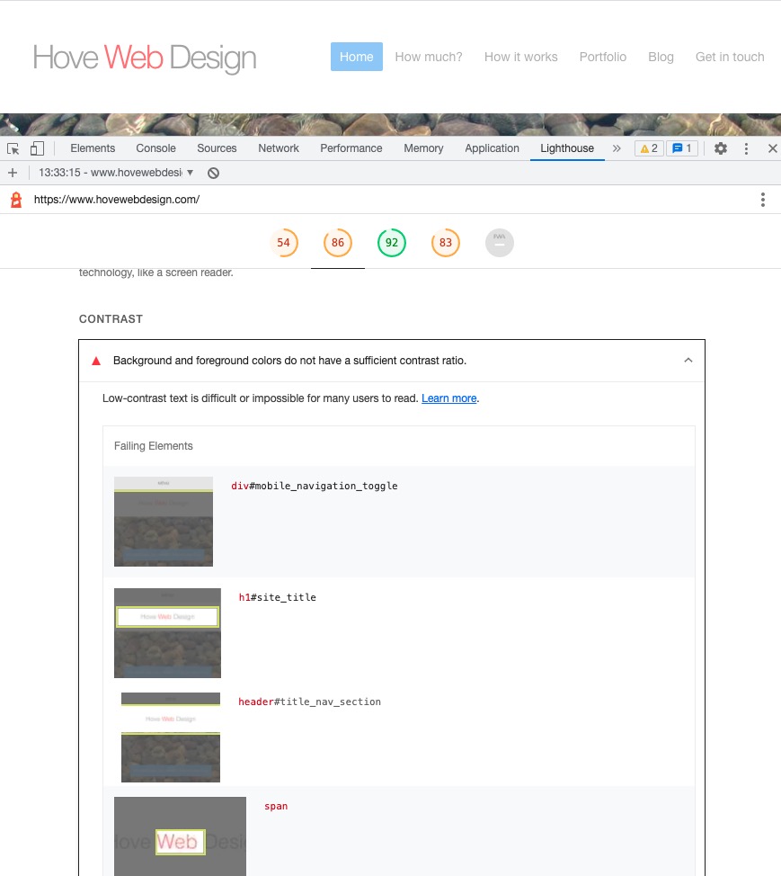
It looks equally feint on Safari and Chrome to me. Peeping under the hood I can see that the Header text is being made partially transparent, and as it is a very thin text anyway, Lato 300, it fades away on some browser / monitor combinations. Also the transparent id blue with a thin transparent text provides less than ideal contrast. You can see ths same issue on your main text logo where the pink WEB appears to loose all of it’s colour.
I would advise to use a heavier font and remove the transparency, and add a more contrasting BG.
It looks okay on both Safari and Chrome here.
Both are the latest versions.
Cheers,
Erwin.