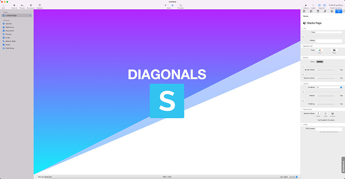
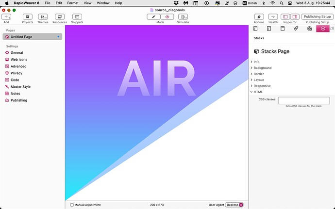
I would like to recreate this screen for a home page, the background with 3 colors, with gradient at the top (the colors will be decided, I think from the top green white and red), and in the middle an image with transparency.
I would like to update a friend’s site using only SOURCE to bring the PageSpeed Insights value from 40 to a minimum of 90.
If I want to use only SOURCE components, can I recreate the page?
How could I do?
2 Likes
Here is a very simple demo of 1 way to do it.
8 Likes
To get that white to transparent fade on the heading, this will do it (to the document Stuart provided, anyway):
h1.stacks_in_22 span {
	background-image:linear-gradient(to top, transparent, white);
	background-clip:text;
	color:transparent;
	}
5 Likes
Nice! I’d go with this to make it a bit more robust / re-usable:
.grad-text h1 {
    background-image:linear-gradient(to top, transparent, white);
    background-clip:text;
    color:transparent;
}
Just add the grad-text class name to either the header stack or the grid item (and switch the header colour back to ‘Base colour’ so that the above css can override it)
2 Likes
And maybe pop a cheeky font size clamp in there to scale the heading size with the width.
1 Like
I’m liking sizing headlines with vw — I’ll have some things to share showing this in due course. vw also produces nice, responsive behaviour with line-height and margins and letter and word spacing and all sorts of other things (including positioning). It’s good for heights, too, as using it in both x and y dimensions keeps everything in proportion. And I’m wondering if it’s really necessary to clamp headlines, because even at 320px something that is 5 vw or more is big enough to have some presence. But I suspect that I’ll be swapping vw for qw when there is enough browser support for container queries.
I’ve been playing around with Stuart’s demo file trying to find a way to put a block of text in either the top (dark gradient) or bottom (white space) sections in such a way that the right or left margin follows the line of the diagonal.
I’ve tried defining a class using various permutations of the shape-outside property with negative shape-margins as shown below, but these seem to only work with floated images. Is what I want to do even possible? Any pointers or advice will be greatly appreciated.
.diagonal-margin-text{
-webkit-shape-outside: polygon(0 0, 100% 0, 100% 19%, 0% 100%);
shape-outside: polygon(0 0, 100% 0, 100% 19%, 0% 100%);
shape-margin: -120px;
}


