Ok, I’ve got a question…but I don’t know how to explain it well…so I’ll just give it a shot :)
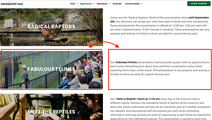
@habitualshaker: On this page (passcode: gvz00), I have three sections with an image on the left and a block of text on the right. However, I’d like to be able to swap the image and the text of the second section (so that the text is on the left and the image is on the right). The problem is that if I just swap the content, it will look fine on desktop…but look strange on mobile because the text of the second section will appear above the image of the second section (whereas the image of the first section will appear before the text of the first section and the image of the third section will appear before the text of the third section.
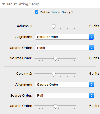
When I was using Foundation, Joe taught me how to do this with the Foundation 2 column stack by adjusting the source order/push/pull settings and it worked great. Is it possible to do a similar thing with Grid Plus in Source?

Any advice would be much appreciated! :)
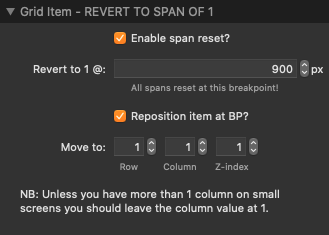
Use the Grid Plus stack, and in the Grid Plus item for each of the breakpoint settings, is an option to “reposition at”. Check that for the Grid Item you want to reposition, and then select the row and colour you want it to be repositioned to. Really simple when you understand this. The rest of the grid items will flow around the repositioned item.
In your example, swap the Fabulous Felines image item and it’s text item, to the way you want it to look on desktop. Then in the Fabulous Feline image item, check the reposition at the BP you choose, to reposition to Col1 Row3 (instead of Col1 Row4). You can now forget all that push pull stuff.
1 Like
Yep - as Gary says it’s the ‘state position / reposition item’ option that you need. It looks like you have added 3 separate grids for each row here. You could do it all in 1 grid if you wanted (apart from anything else it makes consistent styling etc a lot easier if all items are under the same parent). Is probably fine as is though.
If you leave as is then you would just need to reposition the image grid item to be in position column 1 row 1 below your mobile breakpoint. I find it easiest to do this in the final setting of a grid plus item:

Also - i noticed you are using an older version of the theme. Please download the later one here: https://shakingthehabitual.com/downloads/Source.rapidweavertheme.zip
p.s. Stunning site! Love it.
Thanks! That’s super helpful…I’ll give it a try. I had a feeling that the functionality was there, I just didn’t know how to make it happen. Grid Plus is so powerful, I just need to figure it out :)
1 Like
