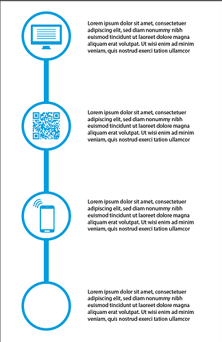
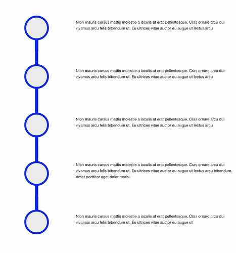
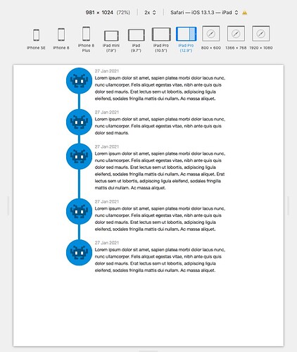
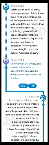
… guys setup something like this.
The textblocks need to stay with the bubbles all the time, visualising a workflow.
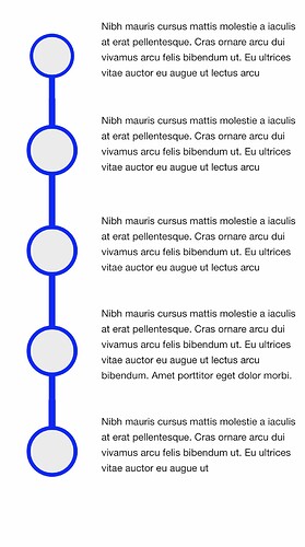
How should it look on mobile at say 375px wide? Should it stay “as-is”, and so really small, or should the columns stack, with perhaps the icons disappearing? (Which is how I’d do it).
I recently did something very similar to this using Source’s GridPlus and also GridPro would work if you need additional more complex controls.
Create a grid using a row template of something along the lines of :
150px 1fr above 700px width
15% 1fr above 450px width
60px 1fr above 320px width
You can also create the variable height icon connecting blue lines if you need to using the same grid. BTW The connecting lines are the hard bit to get right.
These can be very challenging to build correctly depending on the sizes of icons and amount of text but using the Source Grid will allow it to adapt to any size to content. I.e. the blue connection lines can be setup to auto adjust to any content size.
Elixir Graphic had a stack to do this.
But it seems to be gone.
https://elixirgraphics.com/previews/timeline/sample-one/
1LD Responsive Timeline stack?
https://onelittledesigner.com/rapidweaver-stack/responsive-timeline/
yes, the link to purchase doesn’t work
Hey Steve, eitherway: stay as is or maybe a stacked layout
So Source has the option for those conecting lines?
Or did I get you wrong?
You can try this stack to see if works before purchasing
It doesn’t have a tick box setting to add the line.
However you could build a Grid of 3 items for each “row”.
1st item contains the round circle icon
2nd item contains the text
3rd item is a dummy that contains just a background image which is the blue line. This 3rd item is then positioned under the first item.
Because of the way that that GridPro works, the heights of the grid items will be equalised and the blue line will stretch to meet the next row of grid items.
You have complete control over how this layout adjusts and how things are aligned.
… but I need to work myself into Source for that, right?
Or does this work with foundation 6, too?
Yes.
The solution I outlined makes use of Source’s CSS Grid which makes these type of layouts much easier to create. It is a completely freeform way to build layouts that allows you to overlap and layer everything and provides unlimited adjustment of how those layouts adjust as the screen width reduces.
AFAIK Foundation doesn’t use CSS Grid
Foundation 6 and SVG’s created in Affinity Design. I’ve answered your post in Weavers.Space too. Easy.
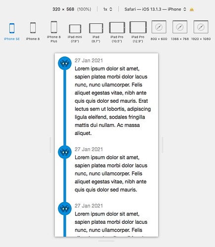
Heres a quick demo I did at Untitled Page | My Website. This one uses a regular border to draw the blue line in the middle of the “column”.
Note how it scales down to 320px without wasting any screen.
awesome,
unfortunately for me it is impossible to play it without an example file, I don’t understand how to do it.
that is fantastic @Webdeersign! works really well. Harder to set up than a dedicated Timeline stack obviously but you do end up with a unique and really flexible result.
It is very possible for you to build it. All of the information you need is written in the demo page. If there is enough interest I may create a turorial when I have the spare time.
I would however, encourage all Source users to learn the basics of using the Source Grid. Otherwise you will find yourself like the guy who buys a Ferrari and never learns that he has more than 1 gear.
Like every solution, break it down into pieces and build each piece.
Start with building a layout with just 2 Grid Items, 1 for an icon (SVG or normal Image) and the second for some text. Hint, use the Row Template = 20% 1f which means that the first “Column” takes up 20% of the width and the 2nd takes up the rest, i.e. 80%.
Then add another Grid Item and use Row Template = 10% 10% 1fr and make the text start in column 3, and make the image span 2 columns and start in column 1. Then add in left and right borders so they show in the centre of the image.
When you know what you are doing , this will take about 1 minute to do.
Thank you, because I want to learn and understand the Source Grids better, I am not interested in the project, but I just want to learn better about the Grids. As soon as I have free time, I follow your instructions. Thank you again.
When you are ready just ask questions if you get stuck, in the Source area, and you will get all the guidance you need.
