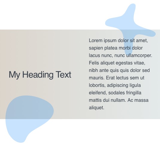
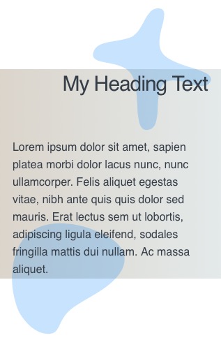
What is the best way to achieve the overlapping shown in the screenshot?
I would prefer to use the source theme…
which stacks to go for when it comes to overlapping content?!
Indeed.
One here with a floating pulsating blob on the right hand side 1/2 way down the page - just done using the Adv Positioning child which works with most of the layout stacks (sections / blueprint etc)
I thought I saw a post a while back, that you were developing a blob stack, is that still happening?
Yes, it’s all done. Everything was on hold while I finished the house renovations as we have to move for my wife’s work. Obviously when that happens now is unknown but as soon as I’ve finished the work then all the new stacks will start to be released.
"all the new stacks" … sounds good! Thanks!
that looks pretty much like what I am aiming for. thank you! I will look into the advanced positioning (never did before)
@Papart Here is a little example in Source - I’ve turned the animated blob into a static SVG for demonstration purposes.
The Adv Positioning child is set to offset the BluePrint relative to its parent (the Source container). I’ve set it to an offset from the bottom of the first container but you could just as easily offset it from the top of the second container.
Obviously you would need to refine it so that it doesn’t float over the content (usually by padding the content) and so make it a bit more responsive friendly but this is just a 2 minute initial set up to demonstrate the idea.
(The advanced positioning child comes with the ProStyles stack and works with SectionsPro, Sections Box and BluePrint)
you are for sure one of the nicest guys on this planet! in fact I can not imagine anyone else I don’t even know personally, that has helped me out so many times! :)
You need to really define how the overlapping layout would behave at different screen sizes and in particular what happens when things collide. Tav’s suggestion is an excellent way to do this.
Another way would be to use the Source Grid Plus in a simplified way. The idea is to create a 1 column grid that is set to reposition each Grid Item to grid position 1 and column position 1 below a huge breakpoint such as 999px. This will reposition the grid items at all screen sizes, and then by increasing the z-index of each grid item you can create layers that will sit on top of each other. The order of the z-index will define where the layers sit with the highest value at the top.
You use the Flexbox positioning or other stacks to push stuff around in the grid items. Initially this can seem a bit like a Rubik’s Cube of a puzzle, but when you understand it, it is very simple.
In the demos below I used 4 grid items:
1 - background colours z-index = 1
2 - left blob shape positioned on the left bottom, z-index = 2
3 - right blob shape positioned on the right top, z-index = 3
4 - text in a column layout with a width set to 900px. z-index = 4
I should say that this isn’t limited to the Source framework, as the Grid Enabler will allow you to use the Source Grid Plus in any theme or framework.
I think the important thing in the original question and screenshot was that the overlapping shape content was in front of the other content, thus the “main” content needs padding out of the way come what may. I thus don’t see the advantage of having the overlapping shape in the DOM flow - i.e. if you were writing the code for this effect you would just use position absolute and keep it simple. With the shape behind the content as in your pics then the whole collision avoidance issue is obviated any way and again position absolute would be the simplest solution and as per the question: “best practice”


