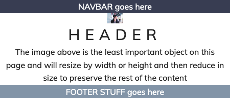
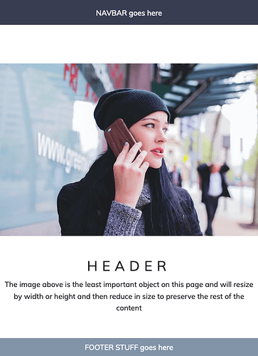
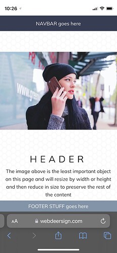
There is a ground breaking layout demo that was created by Jen Simmons over 5 years ago, to show how a full screen layout could be created without using any breakpoints. It just used CSS Grid to size and prioritise the content using just grid rows. In her demo, the image (logo) was the least important object and that would reduce as the screen size reduced.
This type of layout can be ideal for using in modal windows where the challenge can often be to show everything.
I originally created a verson of Jen’s demo using SOURCE’s Grid Plus, but after the recent SOURCE update, decided to take advantage of the new features, and build the layout, just using Coder stacks. The new version is far simpler to view in Stacks and once you become familiar with the process, easier to debug.
The Coder demo is here. Notice how the layout behaves at different screen sizes and also on an iPhone.

4 Likes
Examining your demo with the web inspector reveals how useful the updater Coder stack could be - even in the hands of a novice like me. Thanks!
1 Like
It doesn’t exactly do anything more but the way it can be used now adds an extra layer of usability and a whole new way to build Stacks pages.
1 Like
Responsive sizing of logos is something stacks haven’t offered much support for, except for different widths at different breakpoints. For LockUp I realised that it was going to need to include an SVG child stack that could set widths in vw and cqw (Andrew did include vw in BluePrint SVG). But when I tested what I’d built, the logo got too small on mobile, so I added the option to use a clamp, setting a minimum and maximum size. And this seems to be the new(-er) paradigm for websites, using clamped responsive units for sizing rather than breakpoints. We can then keep breakpoints for layout changes.
This layout uses a minmax pair of values for the row or space required for the image/logo. That is one of the key features of this layout. If you inspect the template rows you will see several types used.


