Srcerer (Sizes) stack lets you link up to 8 different width versions of the same image. Along with some (optional) information about how your image is used on the page - i.e. in one of 2 columns on a desktop but full-width on mobile - Srcerer will generate code that allows the browser to show the most appropriately sized image for whatever device it is being viewed on. This is a great approach to meet some of the challenges that designing for the modern web brings.
Obviously to exploit this approach for responsive image delivery, you will need to generate (up to) 8 versions of your images. You would also want to rename them in a particular way to detail their size, for example for ‘my-image.jpg’ you might end up with:
- my-image-320.jpg
- my-image-640.jpg
- my-image-768.jpg
- my-image-1024.jpg
- my-image-1366.jpg
- my-image-1600.jpg
- my-image-1920.jpg
- my-image-2100.jpg
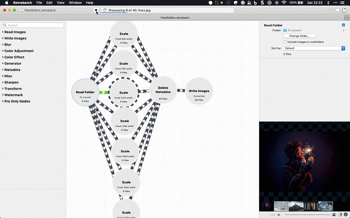
This would be a fairly laborious task if you were to resize and rename the images manually and so I would always recommend a batch process of some sort. My tool of choice is RetroBatch. With RetroBatch you can create a workflow that, for example, takes a folder of images, scales each one to 8 different widths and renames them to include the width value before writing them all into a different folder.
You can view a GIF of this very workflow in action here. This video shows RetroBatch workflow reading a folder of 5 images, resizing them all 8 times and renaming them. These 40 new images only took around 10 seconds to generate. If you use RetroBatch (or want to try out the free trial) then you can download this ‘Srcerer’ workflow.
To then use these images with Srcerer, the recommended approach would be to upload them to your server and then use Srcerer’s magical warehouse ‘formula’ to link the stack to your images. And that’s it. Quick and easy set up for fully responsive and efficient image delivery for your RapidWeaver projects. Your web visitors (and Google) will thank you for it.
